They also used some of the main characters voice as a voice over to fit in with the trailer clip.
They use text in the trailer to show the release date, to show what movies the directors did before and also the production blurb at the end.
The iconography used here are dwarves, a hobbit, a dragon, gold, a wizard, elves, fire, explosions, a mountain, orks, goblins, swords, bows and arrows, a ring and spiders.
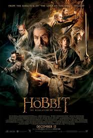
The key conventions used in the film poster for the movie The Hobbit: The Desolation of Smaug are the production blurb at the bottom with all the stars and actors. The release date is just underneath the production blurb with the list of ways you are allowed to watch it by and finally the list of companies at the bottom of that.
The colour scheme used in this film poster is that there is dark, evil colours on the left and bright, harmonious colours on the right. It also looks like 'Gandalf' aka the wizard
No comments:
Post a Comment